

The Hope Wall
The Hope Wall in Richmond, Virginia, was a joint project of John Malinoski, Rob Carter and Ashley Kistler, all with ties to VCU and the Richmond arts community. Conceived in the fall of 2020 as an uplifting place to pay regular visits during a turbulent time, the wall features posters contributed by artists and designers all over the world. A new set of nine posters went up every three weeks centered on the theme of hope as it relates to politics, the pandemic, racial justice. I was honored to participate in the Hope Wall and enjoyed frequent visits—like going to the well—where there was always a group of warm and interesting people coming, or returning, to see what was new.

The Hope Wall, Richmond, Virginia, Spring 2021

The January inauguration still fresh in the air, I went quickly, in my design process, to thoughts of the youth poet laureate, Amanda Gorman, and her moving—and hopeful—performance as my inspiration.

The Hope Wall, by Rob Carter
162 pages | hardcover | 8” x 10”
Published November 2024
Photo Series
In discussing the work of British artist Tacita Dean, who documents artists’ studios through photography, Massimiliano Gioni of the New Museum describes the way in which her work demands attentive viewing. He says, “In an age today when time is compressed and accelerated, to slow down and look is the most radical thing you can do.”
For me, it is through drawing, painting, and photography that I come closest to attentive looking. I am drawn to a certain quality of light, to pattern, repetition, the juxtaposition of unlikely elements, texture, color, and always typography.
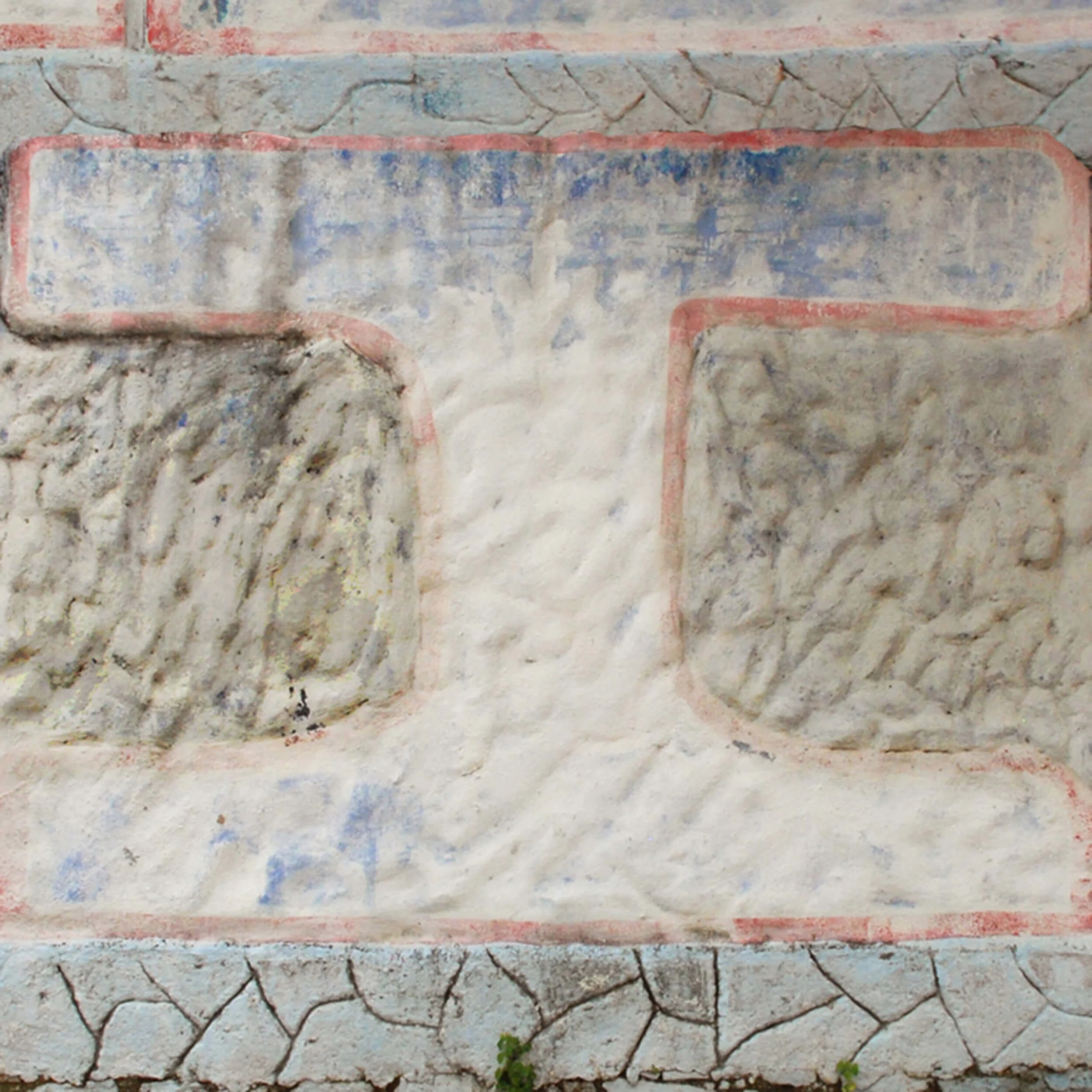
For as long as I can remember, I have been “collecting” images—photographs—often groups of images: signage, gates and doorways, windows, interesting walls (beginning with a challenge years ago from my first design instructor, Lester Van Winkle), abandoned billboards, manhole covers, pavement markings, water towers (have you ever noticed where there’s a water tower, there is almost always a smokestack?), letter forms, whether in nature or in a city setting, urban detritus. Here is a taste.
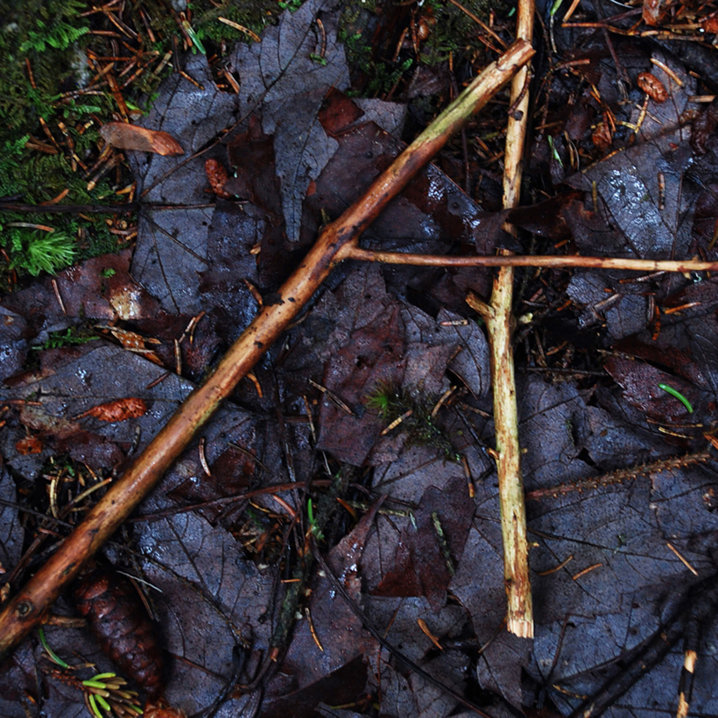


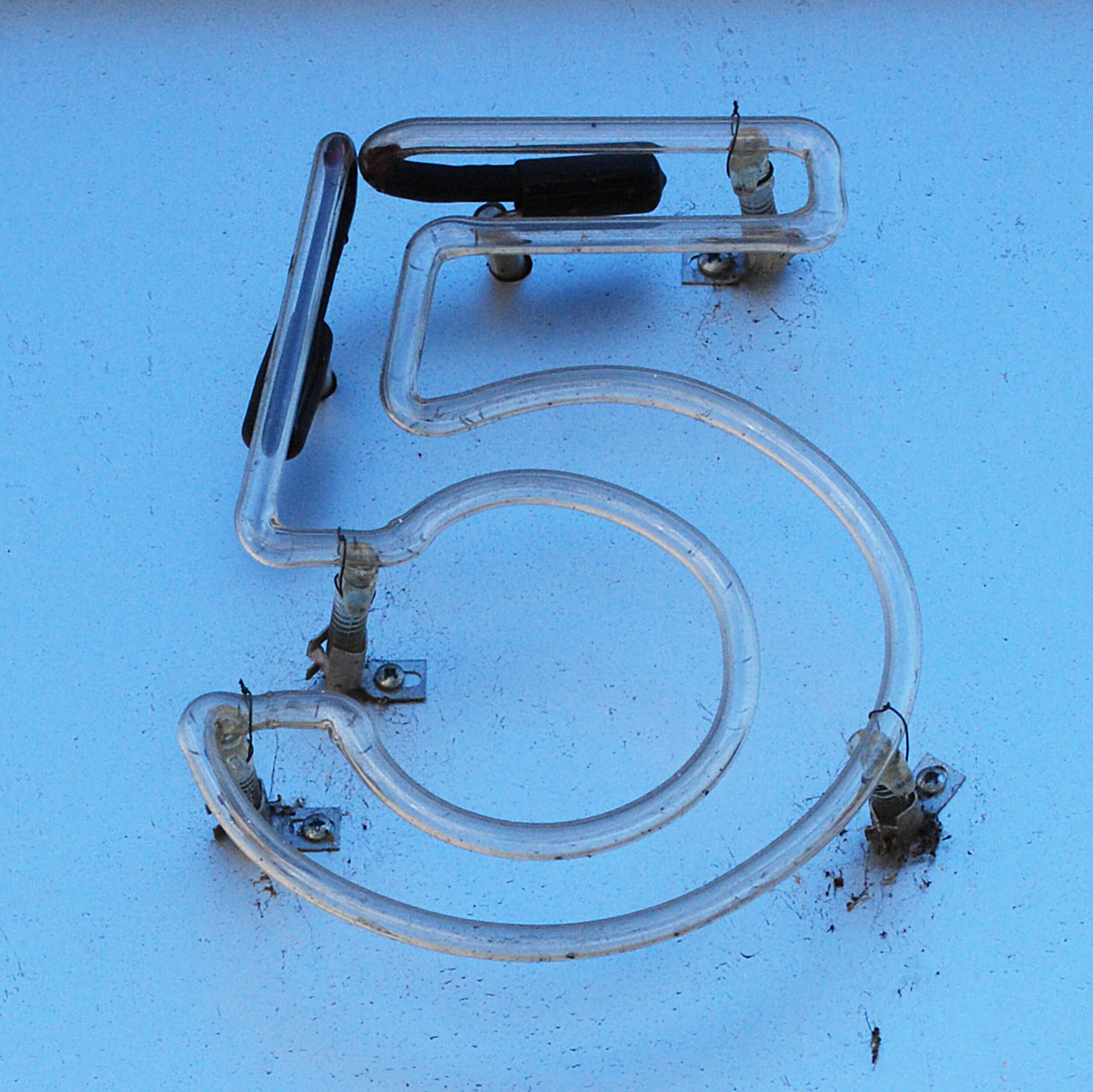
As a graphic designer, I have always said that, before I die, I’d like to design a chair, a lamp, a postage stamp, and a typeface. This sylvan alphabet may be the closest I get to the latter. Some of the “letters” are plentiful in nature—I have lots of Os and Xs, for example—others are harder to find. Below is an urban version.


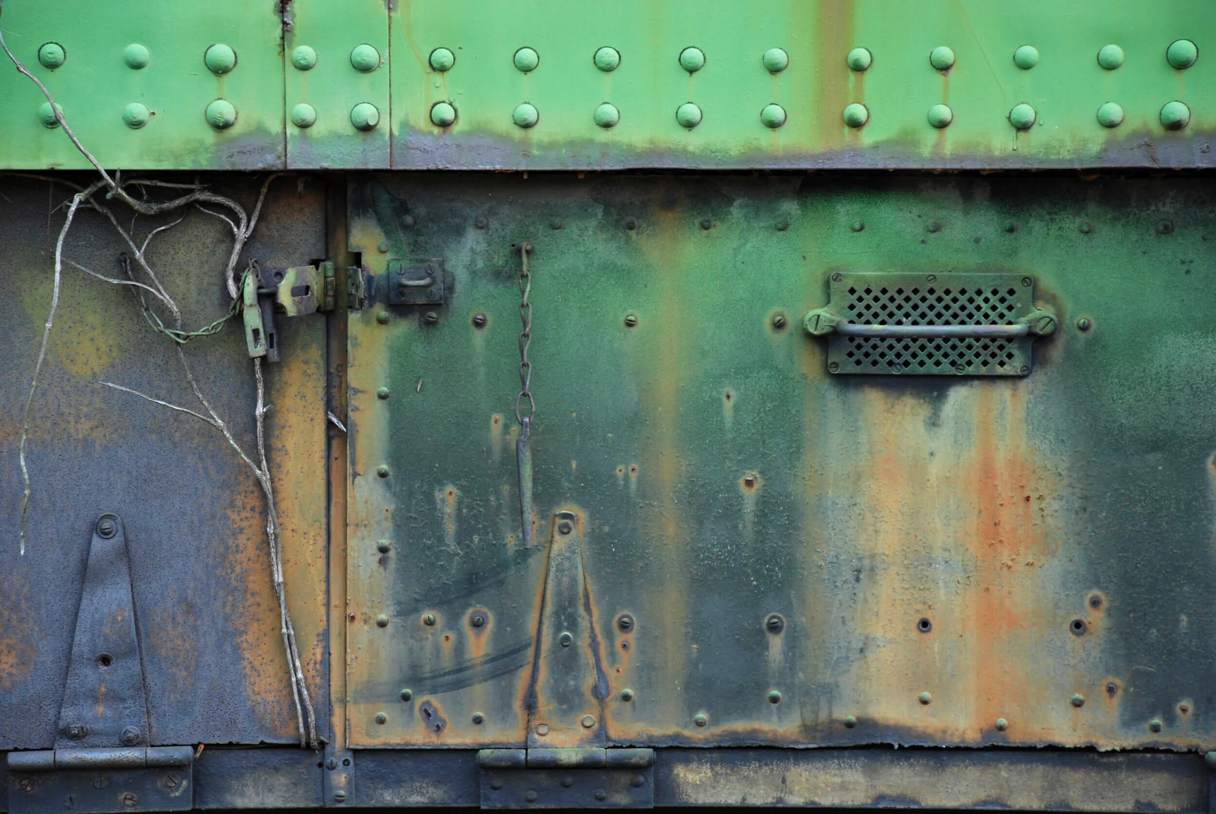
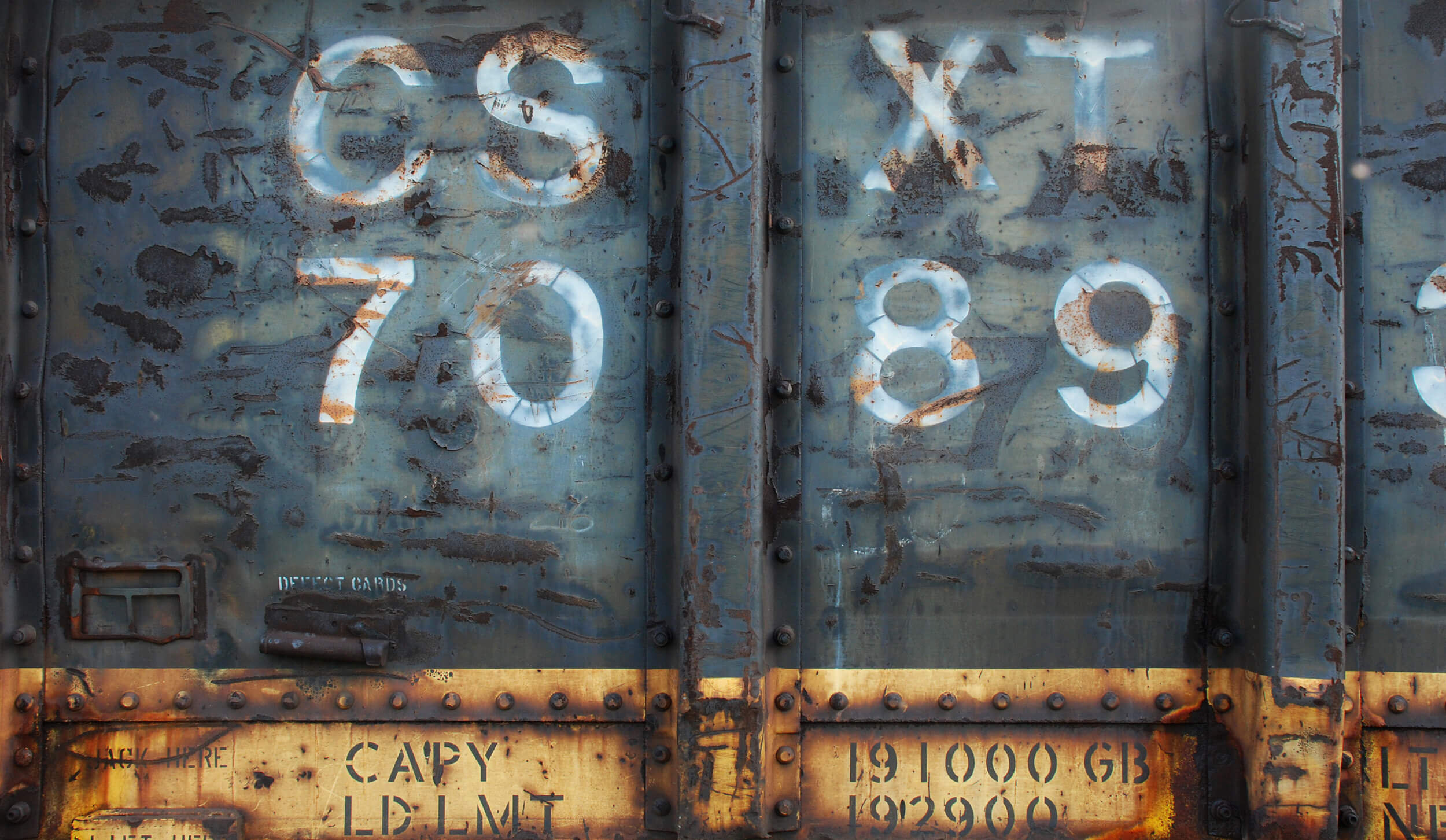
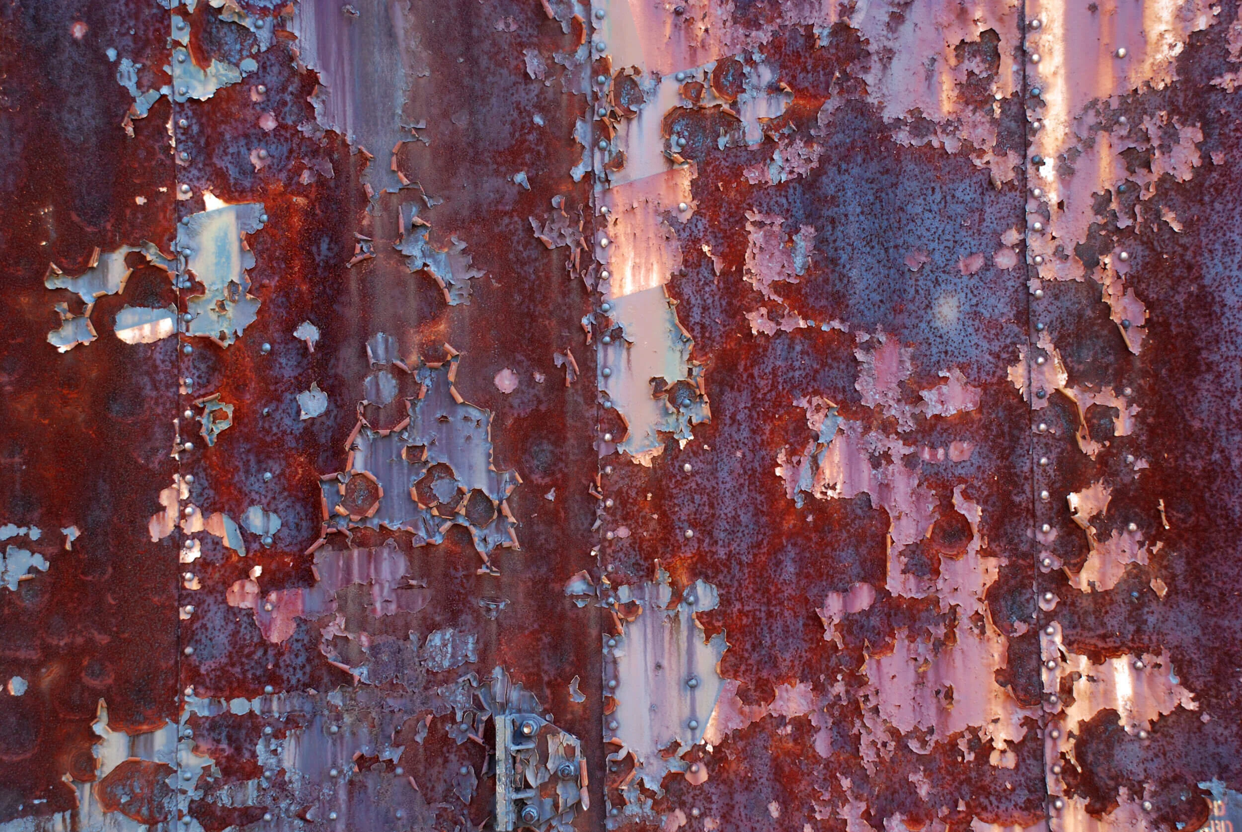
Paint, texture, typography and good old-fashioned deterioration on the sides of mothballed old train cars are the stuff of interesting compositions to my eye. These photographic studies, taken at Smiths Creek train yard in Clifton Forge, Virginia, are like paintings to me, feeding my urge to work in the abstract.


It is the design beneath our feet and the tires of our vehicles. There are so many interesting manhole and utility covers in the world! I fear that the metal ones with their great wear patterns and patinas are on the way out as I see that they are frequently being replaced by plastic versions. The way in which they resemble old, worn coins is part of their appeal for me.
Book Projects
Visit Books or Typophilia Press.